Using a Jupyter Notebook with SPARC data
SPARC datasets can be explored and analyzed on o²S²PARC, the SPARC computational and data analysis platform. In this tutorial you will learn how to develop re-usable and easily accessible data analysis pipelines starting from SPARC datasets.
Getting Started
Download the data
In this example, we use the SPARC Dataset "Influence of direct colon tissue electrical stimulation on colonic motility in anesthetized male Yucatan minipig", contributed by Murial Larauche et al.
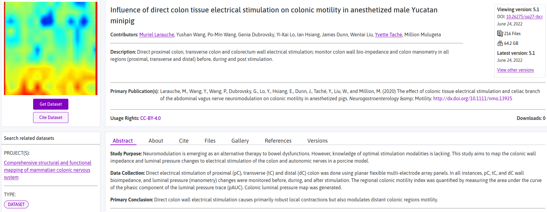
The authors provide several derivative data files, each of which summarize results for multiple subjects and multiple recording electrodes. In this demonstration we look at one particular data file: "sub-all_direct-stim_manometry_distal-colon.xlsx". This file contains colon manometry data collected from multiple subjects that received distal colon stimulation.
You can download the dataset by navigating to "Files > derivative" and then click on the "Download file" button.

Request an o²S²PARC account
If you don't have an account on o²S²PARC, please go to https://osparc.io/ and click on "Request Account". This will allow you to take advantage of full o²S²PARC functionality.
Analyze the data on o²S²PARC
JupyterLab Service
- Go to https://osparc.io/ and click on the "Services" tab
- Enter in the search bar: "jupyterlab math"
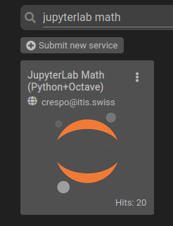
- Click on the "JupyterLab Math (Python+Octave)" Service.
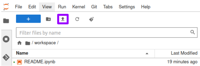
- Once the service is loaded, you will have access the JupyterLab interface. Under the hood, a new o²S²PARC Study is created for you.
- Click on the "Upload Files" button to import the dataset.
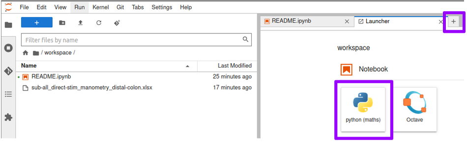
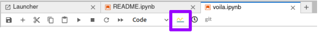
- Create a new Python notebook by clicking on the icons shown below.
Write your analysis code
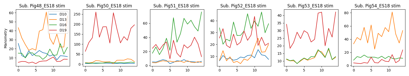
You are now ready to explore and plot your SPARC dataset. For each subject, we have data for pre-stimulation (baseline measurement), during stimulation, and post-stimulation (another baseline). In order to parse out these experimental conditions, we look in the spreadsheet for the designated subsections of cells. Once we have accomplished this, we can start on some real data exploration! The first step is plotting all channels for each experimental condition for each subject for the manometry measurements. You can use the following code snippets to do so:
Install additional Python packages:
%%capture
import sys
!{sys.executable} -m pip install openpyxl
Load the raw data:
manometry_wb = load_workbook(filename='sub-all_direct-stim_manometry_distal-colon.xlsx', read_only=True)
manometry_ws = manometry_wb['Distal - direct distal stim']
Get manometry stimulation data:
labstart = ['A4', 'A23', 'A46','A69']
labend = ['A7', 'A28', 'A51', 'A74']
datend = ['BG7', 'BG28', 'BG51', 'BG74']
datstart = ['AS4', 'AS23', 'AS46', 'AS69']
channels = ['A3', 'A22', 'A45', 'A68']

chan_labels=[]
distalstim_man_stim=[]
for i in range(len(labstart)):
    sub_labels = manometry_ws[labstart[i]:labend[i]]
    chan_labels.append(manometry_ws[channels[i]].value)
    data_rows = []
    indices = []
    for rows in sub_labels:
        for cell in rows:
            indices.append(cell.value)
    for row,chanlist in zip(manometry_ws[datstart[i]:datend[i]],sub_labels):
        data_cols = []
        for cell in row:
            try:
                float(cell.value)
                data_cols.append(cell.value)
            except:
                print(cell.value)
                data_cols.append(np.nan)
        data_rows.append(data_cols)
    stimarray = pd.DataFrame(data_rows,index=indices).T
    distalstim_man_stim.append(stimarray.dropna(0,'any'))

# Combine the different stimulation channel recordings into one dataframe
distalstim_man_stim_total = pd.concat(distalstim_man_stim, keys=chan_labels)
Plot the data:
%matplotlib widget
subjects = distalstim_man_stim_total.keys()

fig, axs = plt.subplots(1,len(subjects),  figsize=[16,3])
for i in range(len(subjects)):
    for j in range(len(chan_labels)):
        axs[i].plot(distalstim_man_stim_total[subjects[i]][chan_labels[j]])
        axs[i].set_title('Sub. ' + subjects[i] +' stim ')
axs[0].legend(chan_labels)
axs[0].set_ylabel('Manometry')
plt.tight_layout()
You should obtain this plot:
Save your o²S²PARC Study
All the code you wrote is saved automatically in the JupyterLab environment. What you need to do is save your study, by clicking on the "Dashboard" button.

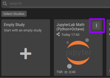
Once it is saved, it will appear on your Dashboard, under the Studies tab. You can edit its title (by default it has the name of the JupyterLab Service), add a thumbnail, description, etc. by clicking on the "three dots" button.
Optional: share your o²S²PARC Study
o²S²PARC makes collaborative data analysis very easy. Now that you have created a data analysis pipeline, you can share it with your collaborators. You can share it in two different ways:
- Share your study: collaborators will have access to the study you have just created and all of you will work on the same instance
- Publish the study as a template: from the template, collaborators will have their own instances of a study.
You can read more about sharing studies on o²S²PARC here.
Optional: turn your data analysis into a standalone web application
You might want to only show analysis graphs or widgets to interact with the data without showing the underlying code. This is very easy by using the JupyterLab Voilà extension integrated into o²S²PARC.
An example of such voila-based web application is this SPARC dataset, associated with this o²S²PARC study
- From inside the JupyterLab Math service, rename your notebook to "voila.ipynb".
- You can see how it will look like by clicking on the "voila preview" button
- Go back to the dashboard, in the same way you did when you saved your study.
- On the Study card, click on the three dots button to access the "More Options" dialog.
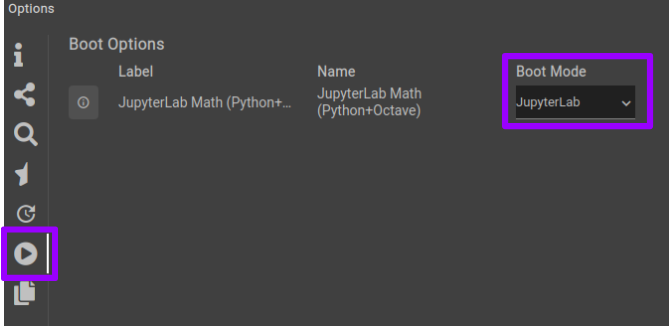
- Use the play button on the left to change the Boot Mode from JupyterLab to Voila
Related webinars
The topics covered in this tutorial are also treated more extensively in these webinars:
Updated 11 months ago